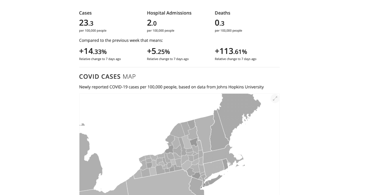
During the early COVID-19 pandemic, I worked with Carnegie Mellon University's COVIDcast project, prototyping data visualizations and user interactions to help the public understand hospitalization, transmission, and movement trends across the country.
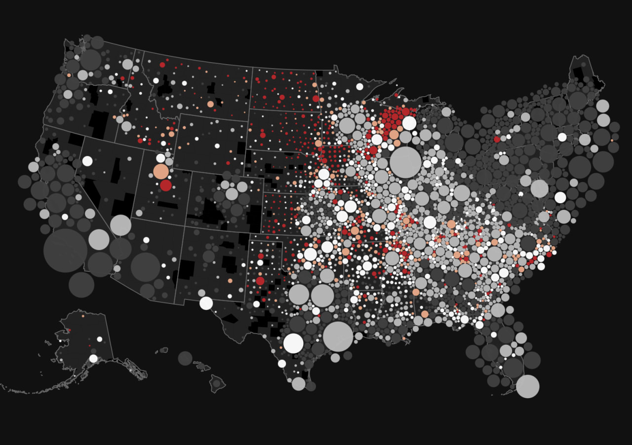
Scrolling the COVIDcast dashboard as it runs today — indicator tiles, the county-level map, and the signals tableCOVIDcast dashboard: weekly case, hospitalization, and death rates above an interactive county-level mapPopulation density map of the United States with circles sized by population, colored white to red indicating concentration in the Midwest and Northeast.